3 min read
8 Ways to Make Your Waiting Room A Patient Destination
 Corde Kurtz
:
Updated on December 5, 2023
.jpg)
Most patients spend about 20 minutes in a waiting room before they’re called back to their appointments. And studies suggest that after 30 seconds of waiting, people's sense of time begins to be distorted. This means that 20 minutes can feel like an hour to unengaged or bored patients, all leading to a hindered patient experience (and even lower reviews!). To prevent this, it’s important to present an environment that feels welcoming, comfortable, and even informative—not outdated, institutional, and transactional.
Just one bad provider experience can lead to lost patients and a lack of trust in your brand message.
When was the last time that you walked in through your front door? Have you sat down in your waiting room recently? The first thing you need to do to improve your patient experience is audit your waiting room from the lens of a patient.
Pay attention to:
- The lighting
- The scent
- The sound
- The furniture
- The paint and carpet
- The check-in station
- The overall layout of the space
Don't love what you see? Don't panic. We've got 8 different ways listed here that you can use to take your waiting room from drab to fab.
8 Ways You Can Spruce Up Your Waiting Space
1. Be Strategic with Furnishings and Layout
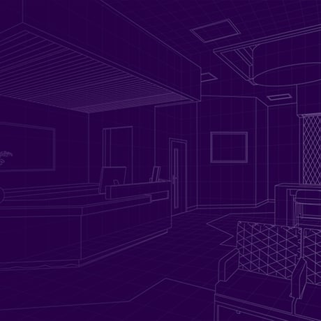
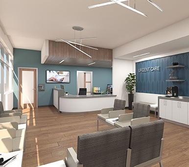
If chairs lined up around a pale, oak coffee table full of two-year-old celebrity magazines doesn’t make you want to leave a waiting room, then maybe sitting next to someone watching loud videos on their phone will. Think through the patient experience and design with that in mind. For example, a layout that includes niche-use areas and varied seating arrangements. Add tech-enabled tables or work areas for visitors to use, along with activity areas for children. Overall, consider who will come through your doors; their ages, the reasons for their visit, their mobility levels, and activities they might enjoy doing as they wait.
2. Use Lobby Management Software to Aid in Efficiency
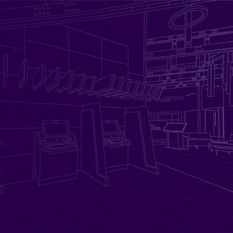
Today’s digital appointment management systems can help speed up patient appointments as well as save your staff time. With this technology, visitors entering the waiting area can use a kiosk near the entrance to check in, sign HIPAA agreements, and validate insurance information. Additionally, integrated tablet technology can aid in pre-appointment questionnaire completion, surveys, and future appointment scheduling.
3. Place Digital Signage in Key Locations
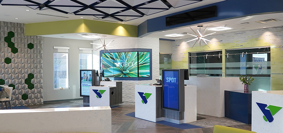
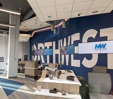
Adding digital signage solutions to waiting rooms is a unique way to make time go a little faster for visitors as well as educate, entertain, and share announcements. Whether you want to give health tips, run inspirational video clips, or show dates for upcoming community events, you’ve got many options to help patients and their families feel relaxed and welcome. Dynamic screens, video walls, and interactive kiosks all work well in these areas.
Digital displays reduce perceived waiting times by 35%! (Digital Signage Today)
4. Make Wayfinding Easy
Entering a healthcare facility and then hitting a bottleneck while entering the waiting room can be a frustrating element of a patient’s visit. Traffic should be able to flow freely, without visitors having to cross through exit traffic or retrace their steps.
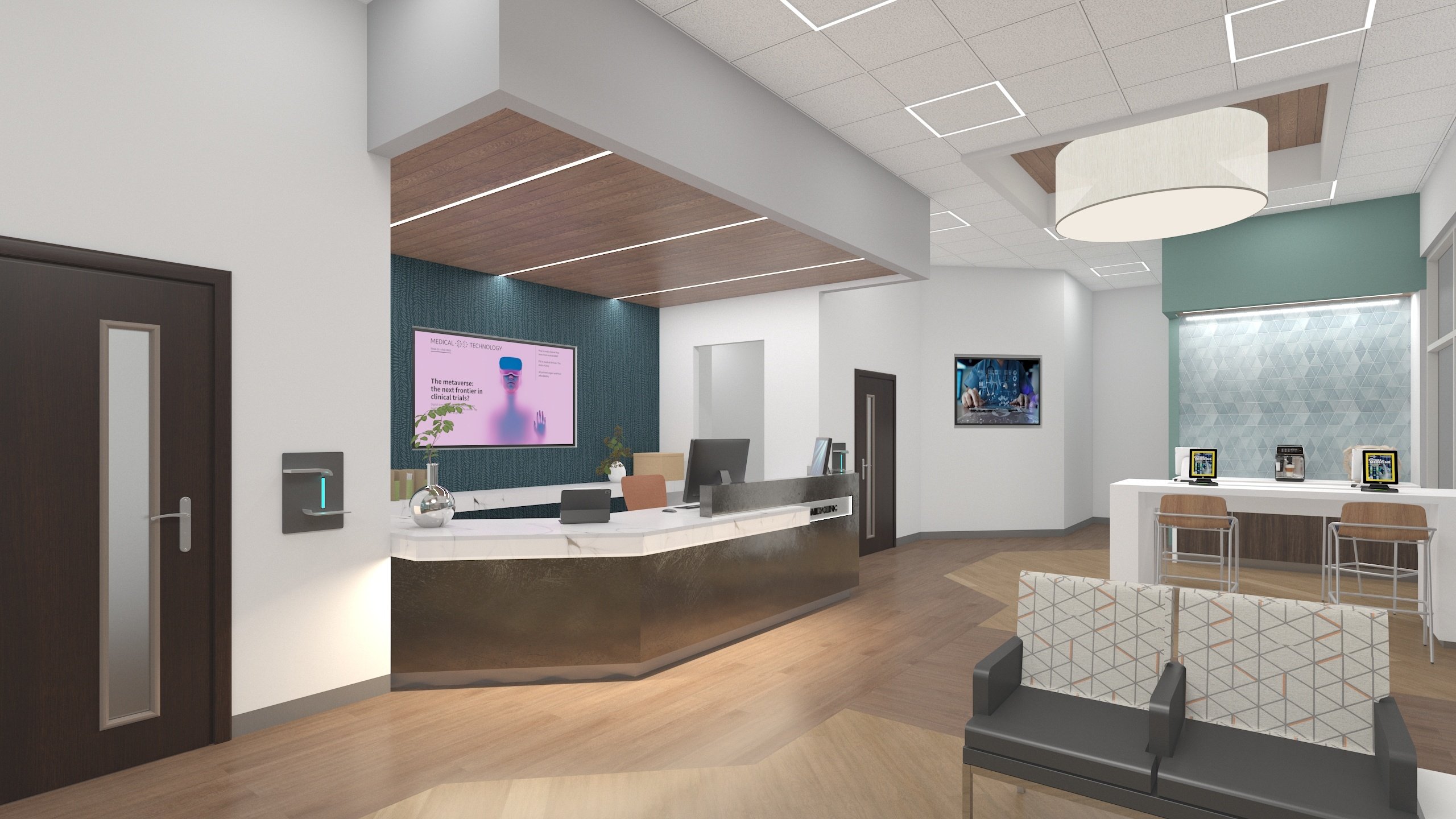
With functional architecture, the waiting room can be redesigned to direct patients from a check-in kiosk or desk to a choice of seating locations and then to the doctor’s office or exam room. Coordinating colors, patterns, and lighting options all help facilitate this flow of movement. Even subtle designs can help guide patients, making their visit more comfortable.
5. Install Elements that Absorb Sound
A noisy waiting area is a nerve-wracking one, especially when a patient isn’t feeling well or you’re caring for someone who isn’t well. That’s why a room design should include sound-absorbing materials and allow adequate space between the reception desk, seating locations, and common areas.
Here are a few material options to try in your design-build:
- Acoustic wall and ceiling panels
- Perforated wood-look ceilings
- Rubber-sheet flooring
- Glass fiber panels
6. Choose Calming Color Schemes
While waiting areas must be bright, it’s also important that they are calming and welcoming. Blue can bring feelings of security and loyalty while green tends to evoke tranquility; some shades of coral and pink denote compassion. If walls are to remain white, choose accent pieces and furniture featuring well-chosen colors to help offset the white.
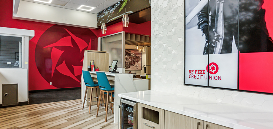
You may also want to incorporate your organization’s theme colors into the overall scheme to be consistent with your advertising and brand recognition.
7. Add Appropriate Lighting
Natural light from large windows is an ideal feature of a waiting room, so if possible, bring that into your design scheme and allow for good views of the outdoors. Plan overhead light fixtures in work areas and indirect lighting like floor lamps and well-placed sconces elsewhere to help soften the room. When it comes to bulb type, stay away from fluorescent (too harsh) and look into LED options; these are the most energy-efficient, generate less heat, and will save on operating costs in the long run.
8. Choose Natural Design Elements
If you’re thinking about adding some art to your waiting room walls, landscapes and cultural pieces make nice room accents but make sure the artwork you choose complements the room’s overall color scheme. Try placing a couple of potted plants in different areas as well; this can help soften the environment and make it more inviting. Local artwork and photos also make intriguing additions and tend to promote conversation.
Ready to take the next steps?
When you’re ready to design or redesign your healthcare waiting rooms, DBSI is here to help you realize your ambitions and goals. From room layout and lighting placement to digital signage solutions and furniture selection, our award-winning, design-build team can transform your spaces from outdated and ordinary to modern and spectacular.
Connect with the Author! Find Corde on LinkedIn.


