1 min read
Award Winning Design: This Arizona Credit Union Branch Hits All the Right Notes
 Brian Silvester
:
Updated on June 15, 2023

After a major re-branding campaign in 2016, Deer Valley Credit Union put DBSI to the task of transforming their Anthem branch into a space that exemplified their defining values—own, simple, and personal.
The result is a branch that was awarded in the 2017 Design Excellence Awards for a Special Function Space from the American Society of Interior Designers Arizona North Chapter.
For this branch, DBSI set out to create a space that eliminates the barriers found in traditional branches, with a free-flowing, open concept plan that’s inviting and easy to navigate.
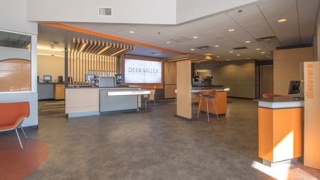
Members can use the large interactive kiosk near the front entrance or a tablet at a Discovery bar for information that’s readily available with a click or tap, while eliminating clutter and reducing need for print marketing.
Wood slating and a video wall help draw members’ attention towards the teller pods for service and transactions. Here, staff and credit union members are no longer divided into “teller” and “member” sides. Standing hip to hip, associates can provide a more personal service, enhanced privacy, giving members a sense of belonging.

Nearby, a sit-or-stand Service Spot allows for quick conversations or more in-depth discussions as needed.
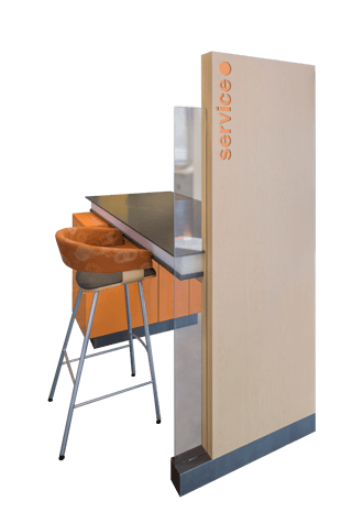
A mix of vibrant orange details throughout—from furniture and wall paint, to the logo-inspired light fixture—as well as concrete, metal and wood finishes give the space a fun yet clean and simple aesthetic.
In addition to this winning design, one of the greatest feats of the project was completing construction in under 8 weeks without shutting down the branch, interrupting daily operations, losing revenue or inconveniencing members.
What used to be a nondescript and inefficient space is now a vibrant and engaging environment, enhancing both the member experience and branch productivity, earning admiration of current members and the attention from their target-market.











.jpg)

-1.png)