

If you're like most of us, you probably felt unprepared, extremely tired (those were the nights we stayed up past 8 o’ clock) and you were probably nervous about the costs you were about to inherit (because books aren’t cheap).
But not today.
Now, students can conveniently fund their expenses with numerous financial institutions planting a branch in the middle of universities. Over 11% of college campuses currently have a financial institution on site, hoping to reach that obscure Millennial segment.
As we know, reaching the Millennial group can be difficult—but the dividends can be big. With 80 million Millennials in the U.S., these are your future clients and reaching them now is key.
So, whether you already have a branch on campus, or you are looking to expand, here are the top 6 branch design trends to help you “hit the books” and have college students lining up at your door. (Free food might also help).
1. Mixed-Use Location: Book Stores Have Space 
Is your local university looking to rent out space next to their book store? With the rise of online book stores, many campus stores don’t need the space that they used to.
Does your area have a local coffee shop that is ready to move on-campus, but doesn’t need all the real estate? Take advantage of a branch design that will allow you to get in front of more students, onboard more efficiently and help them with their school expenses.
2. Service Spot: Assist Students Before Class
 Now that all the students have seen your newly designed branch next to the campus bookstore, how do you make sure they all have a convenient place to discuss their finances?
The answer? Service Spot.
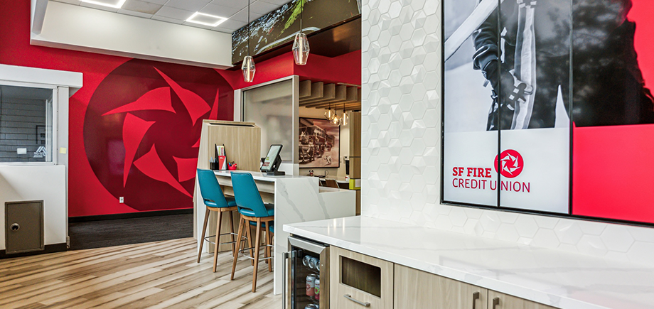
These “Desk” configurations have the feel of an Apple Genius Bar—a perfect fit for technology savvy students. Set up to be about bar height and inviting, students feel more comfortable talking with an associate about opening up that credit card they need to buy books.
Plus, these smaller footprint configurations allow you to use your space more effectively, and can be moved around the branch in any configuration. Now associates can move around freely, and students can talk with a staff member at a Service Spot, no matter what type of service they need.
3. Interactive Digital Kiosks: Let Students Learn More
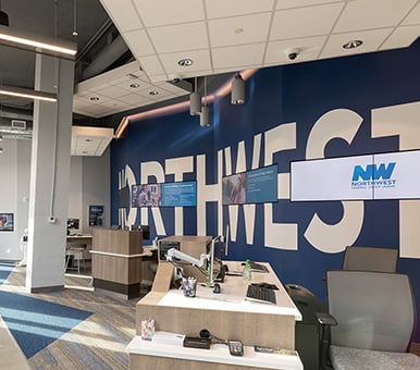
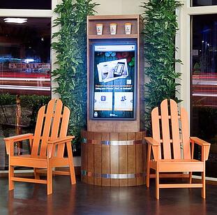
We all know that the younger generations feel comfortable around technology. Interactive digital kiosks can make a big impact on branch design with students as it gives them options to interact with your products and services while they wait to be helped. Even better, you can publish your social media feed on it so that they can learn more about you and you learn more about what they need from you.
4. Micro-Branches: Make the Most of Small Spaces
-1.jpg?width=406&name=BCU-TechDrive-6%20(4)-1.jpg)
You’ve done your research and noticed that the local university only has room for you to plant an ATM in the University Union. That’s more than enough space to make a big impact!
Take California Coast Credit Union on the campus of SDSU for example. With only 715 Sqft of branch space, and only an ATM, they’ve been able to post some amazing results in a few short months— 500 new accounts, $700,000 in new loans and 24,600 ATM transactions.
USECU is another example of a financial institution making the most of a small space on campus. Located in the middle of a food court, USECU uses a recycler to handle all transactions, and has digital signage and interactive kiosks running 24 hours to entice students with their messaging and services.
5. Community Boards: Yes, More Digital Signage
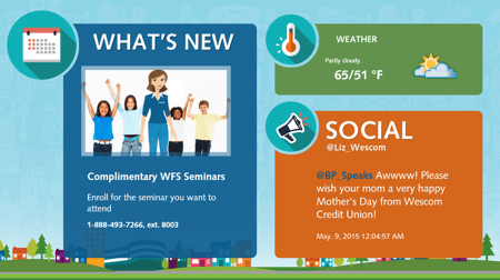
College campuses are filled with events. Whether it is a fun 5k run, a co-ed volleyball tournament or even a week filled with Greek Life games, your branch should be a part of it. Inform students of these action-packed events on your new and improved community boards. This will allow you to sneak in details about your great student checking accounts and also inform the many set of eyes of the events happening near them. It’s truly a game-changer.
6. Financial Heath Check: The Homerun to Making Connections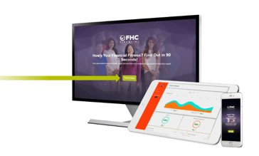
Do you wish there was a way to gauge which products students need? An ice-breaker to get the conversation started? Or even a campaign to make students want to use your products to make their lives better?
Well, now there is a way, and it’s pretty cool. Financial Health Check is a new online and mobile app that you can use on tablets, smartphones and computers that allows students to see exactly how “healthy” their finances are and how they compare to their peers.
By putting this in front of students, you give them a fun, gamification-way to learn about their needs and financial education, while you get to know more about the person you want to speak with. Meaningful conversations become easy and students find the credit card or auto loan that fits them best.
There’s lots of creative ways to start reaching students and making them feel comfortable branches on campus. What creative designs/trends have you seen or tried? Leave them in the comments.
Are you stuck trying design a university branch? We are here to help. Start the conversation by contacting us here.











.jpg)

-1.png)